Visualization with ySights
This tutorial demonstrates ySights’ built-in visualization capabilities for creating publication-ready plots.
What You’ll Learn
Global trends visualization
Topic evolution plots
Profile similarity visualizations
Recommendation system plots
[1]:
from ysights import YDataHandler
from ysights import viz, algorithms
import matplotlib.pyplot as plt
import numpy as np

%matplotlib inline
[2]:
# Initialize data handler and network
db_path = 'ysocial_db.db'
ydh = YDataHandler(db_path)
network = ydh.social_network()
1. Global Trends Visualization
Daily Content Trends
Visualize how content creation changes over time.
[3]:
# Plot daily content trends
fig = viz.daily_contents_trends(ydh)
plt.tight_layout()
plt.show()

print("This plot shows the number of posts created each day throughout the simulation.")

This plot shows the number of posts created each day throughout the simulation.
Daily Reactions Trends
Analyze how user engagement (likes, reactions) evolves.
[4]:
# Plot daily reactions
fig = viz.daily_reactions_trends(ydh)
plt.tight_layout()
plt.show()

print("This shows user engagement patterns over time.")
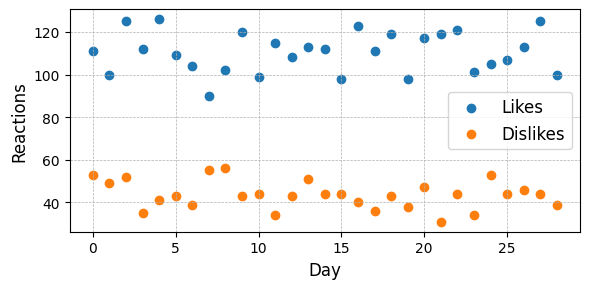
This shows user engagement patterns over time.
Content per User Distribution
Show how many posts each user creates.
[5]:
# Plot content distribution
fig = viz.contents_per_user_distributions(ydh)
plt.tight_layout()
plt.show()

print("Distribution of content creation across users (log-log scale).")
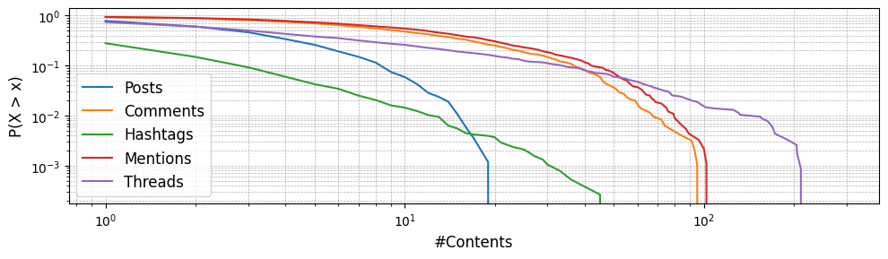
Distribution of content creation across users (log-log scale).
Trending Hashtags
Identify the most popular hashtags in the simulation.
[6]:
# Show top hashtags
fig = viz.trending_hashtags(ydh, limit=15)
plt.tight_layout()
plt.show()

print("Top 15 most used hashtags in the simulation.")
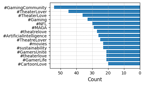
Top 15 most used hashtags in the simulation.
Trending Emotions
Analyze the emotional content of posts.
[7]:
# Show emotion distribution
fig = viz.trending_emotions(ydh)
plt.tight_layout()
plt.show()

print("Distribution of emotions in posts.")
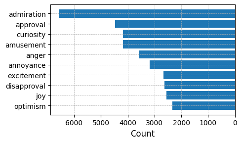
Distribution of emotions in posts.
Trending Topics
Identify the most discussed topics.
[8]:
# Show trending topics
fig = viz.tending_topics(ydh, limit=10)
plt.tight_layout()
plt.show()

print("Top 10 most discussed topics.")
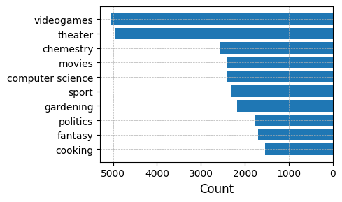
Top 10 most discussed topics.
Comments Distribution
Analyze how many comments posts receive.
[9]:
# Plot comments per post
fig = viz.comments_per_post_distribution(ydh)
plt.tight_layout()
plt.show()

print("Distribution of comments per post.")
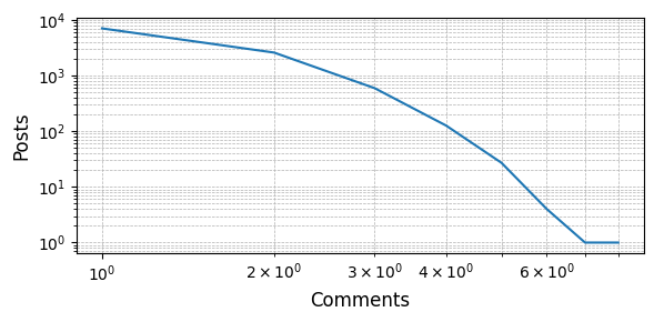
Distribution of comments per post.
2. Topic Visualization
Topic Density Temporal Evolution
Visualize how topic interest evolves over time (requires Plotly).
[10]:
# Interactive topic evolution plot
try:
    fig = viz.topic_density_temporal_evolution(ydh, min_days=15)
    fig.show()
    print("Interactive plot showing topic evolution over time.")
    print("Hover over the heatmap to see detailed information.")
except Exception as e:
    print(f"Could not create plot: {e}")
    print("Make sure plotly is installed: pip install plotly")
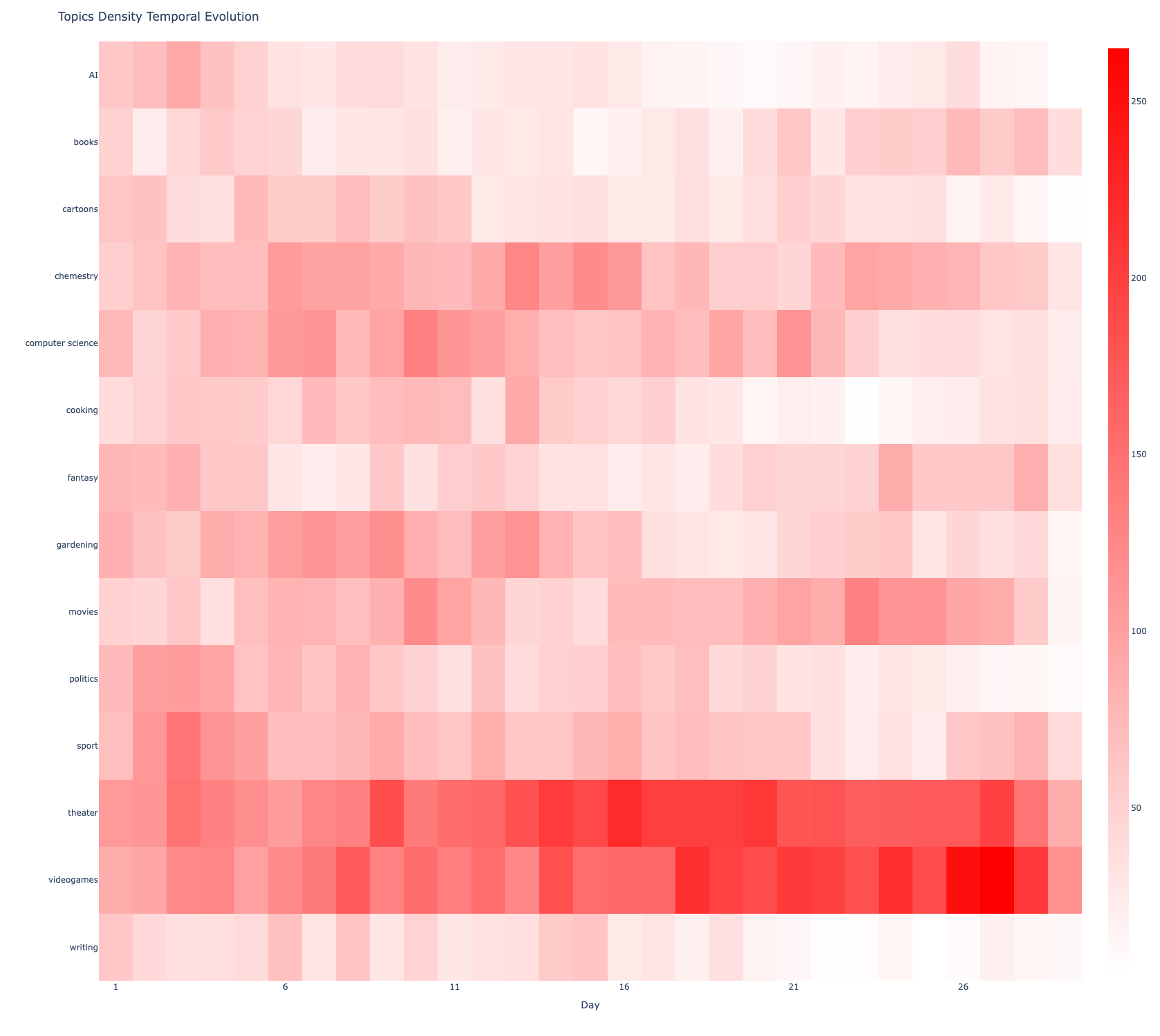
Interactive plot showing topic evolution over time.
Hover over the heatmap to see detailed information.
3. Profile Similarity Visualization
Profile Similarity Distribution
Visualize the distribution of similarity scores.
[11]:
# Calculate similarity scores
similarity = algorithms.profile_topics_similarity(ydh, network)

# Create distribution plot
fig = viz.profile_similarity_distribution([similarity], ['All Users'])
plt.tight_layout()
plt.show()

print("Distribution of profile similarity scores across all users.")
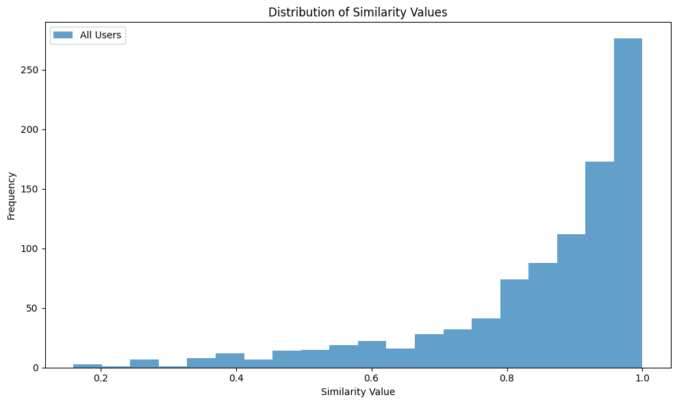
Distribution of profile similarity scores across all users.
Similarity vs. Network Degree
Analyze the relationship between network position and profile similarity.
[12]:
# Plot similarity vs degree
fig = viz.profile_similarity_vs_degree([similarity], [network], ["All Users"])
plt.tight_layout()
plt.show()

print("Relationship between user connectivity and profile similarity.")
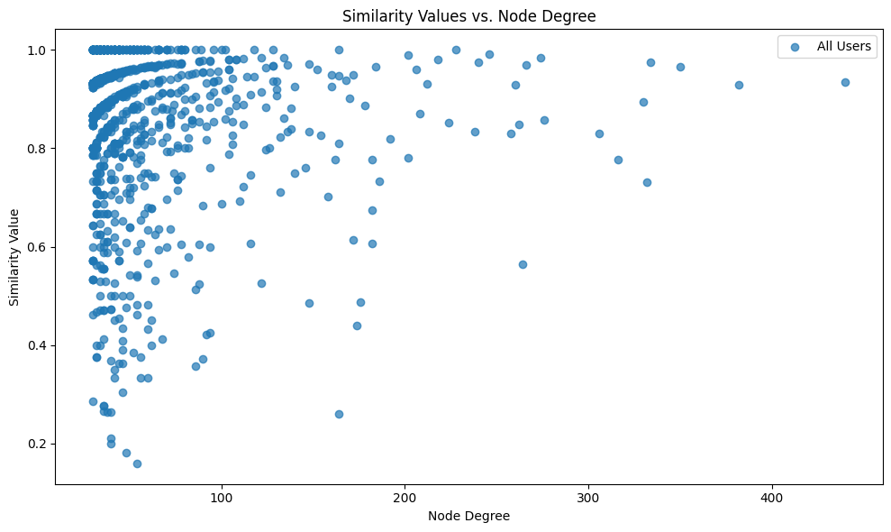
Relationship between user connectivity and profile similarity.
Binned Similarity per Degree
Show average similarity for users grouped by their network degree.
[13]:
# Binned analysis
fig = viz.binned_similarity_per_degree([similarity], [network], ["All Users"], bins=10)
plt.tight_layout()
plt.show()

print("Average similarity scores grouped by network degree bins.")
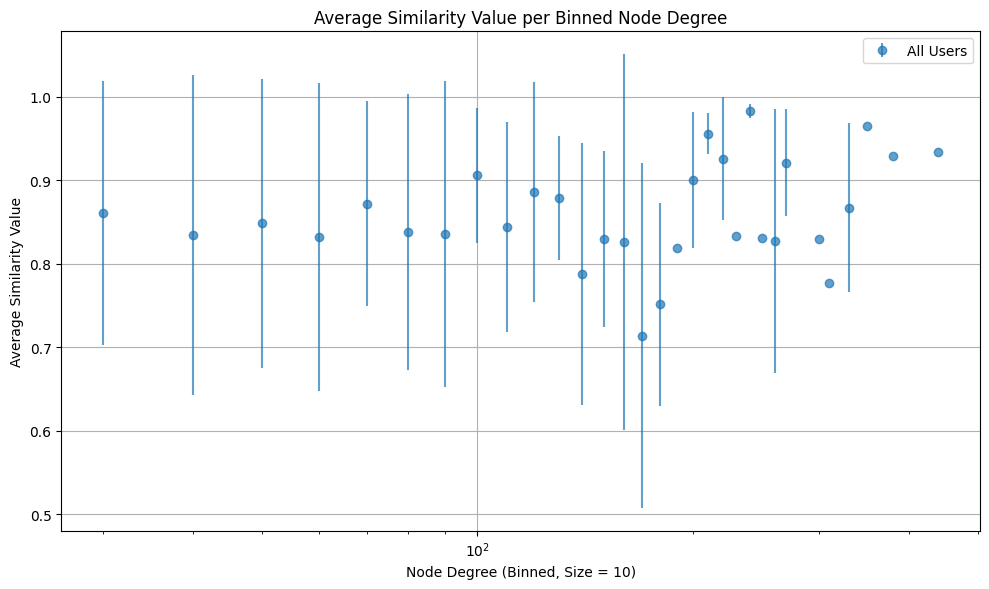
Average similarity scores grouped by network degree bins.
4. Recommendation System Visualization
Recommendations per Post
Analyze how many times posts are recommended.
[17]:
# Plot recommendation distribution
fig = viz.recommendations_per_post_distribution(ydh)
plt.tight_layout()
plt.show()

print("Distribution of recommendations per post.")
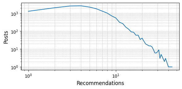
Distribution of recommendations per post.
Recommendations vs. Reactions
Analyze the relationship between recommendations and user reactions.
[18]:
# Plot recommendations vs reactions
fig = viz.recommendations_vs_reactions(ydh)
plt.tight_layout()
plt.show()

print("Relationship between number of recommendations and reactions received.")
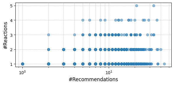
Relationship between number of recommendations and reactions received.
Recommendations vs. Comments
Analyze how recommendations affect comment engagement.
[19]:
# Plot recommendations vs comments
fig = viz.recommendations_vs_comments(ydh)
plt.tight_layout()
plt.show()

print("Relationship between recommendations and comments.")
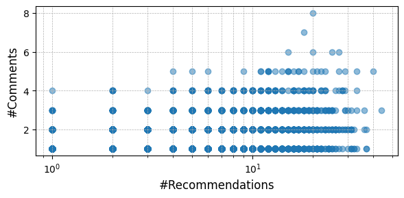
Relationship between recommendations and comments.
5. Saving Visualizations
Save plots for publications or presentations.
[21]:
# Create and save a high-resolution plot
fig = viz.daily_contents_trends(ydh)
plt.tight_layout()

# Save as PNG
plt.savefig('daily_trends.png', dpi=300, bbox_inches='tight')
print("Saved as daily_trends.png (300 DPI)")

# Save as PDF for publications
plt.savefig('daily_trends.pdf', bbox_inches='tight')
print("Saved as daily_trends.pdf (vector format)")

plt.show()
Saved as daily_trends.png (300 DPI)
Saved as daily_trends.pdf (vector format)
Summary
In this tutorial, you learned:
Best Practices
Use high DPI (300+) for publication-quality figures
Save as PDF or SVG for vector graphics (scalable)
Use consistent color schemes across related plots
Add clear titles and labels to all axes
Include legends when comparing multiple datasets
Use grid lines sparingly for clarity
Next Steps
You now have a complete toolkit for analyzing YSocial simulations:
Combine insights from all tutorials for comprehensive analysis
Experiment with different parameters and configurations
Create custom analyses for your specific research questions
[ ]: